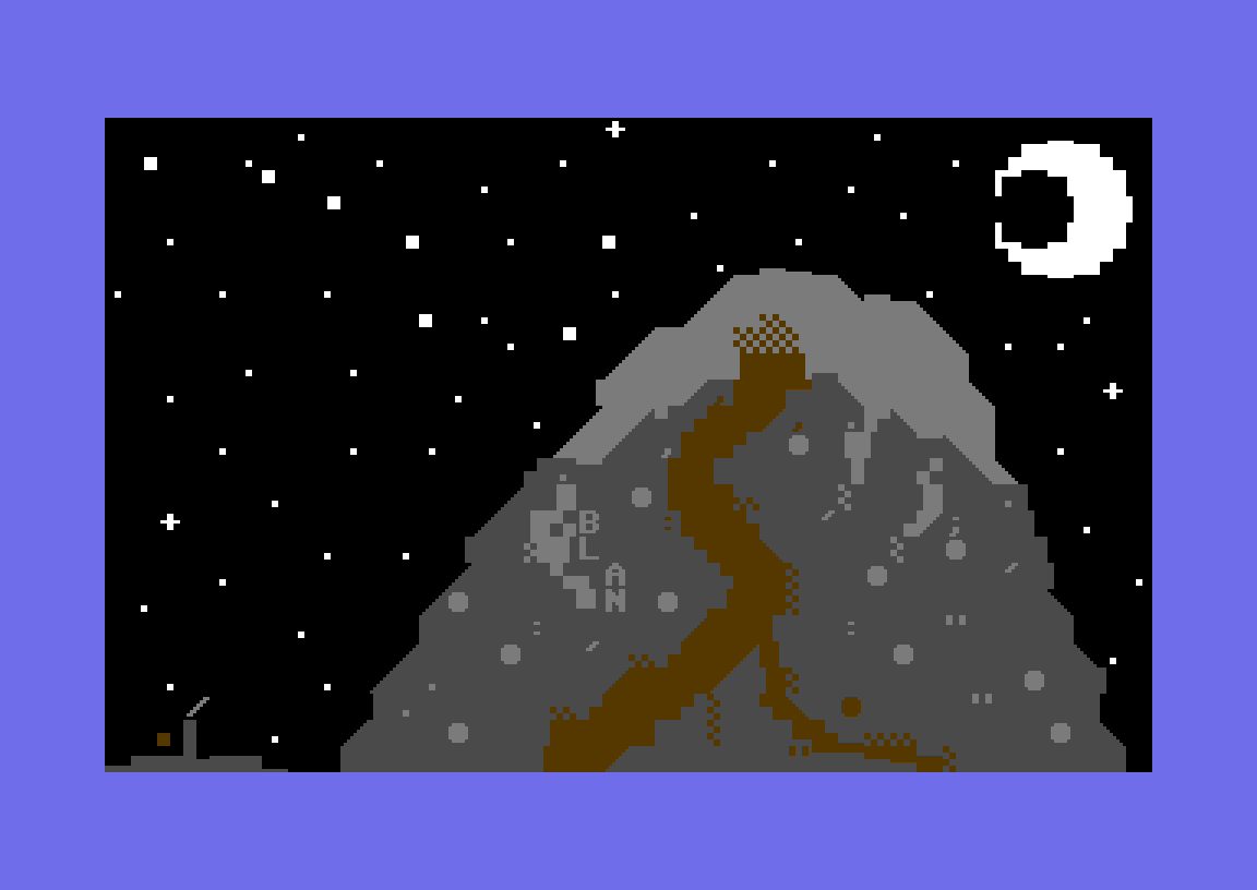
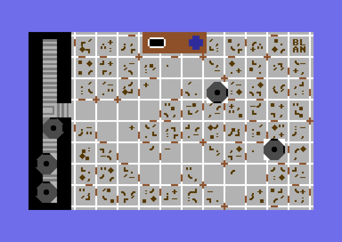
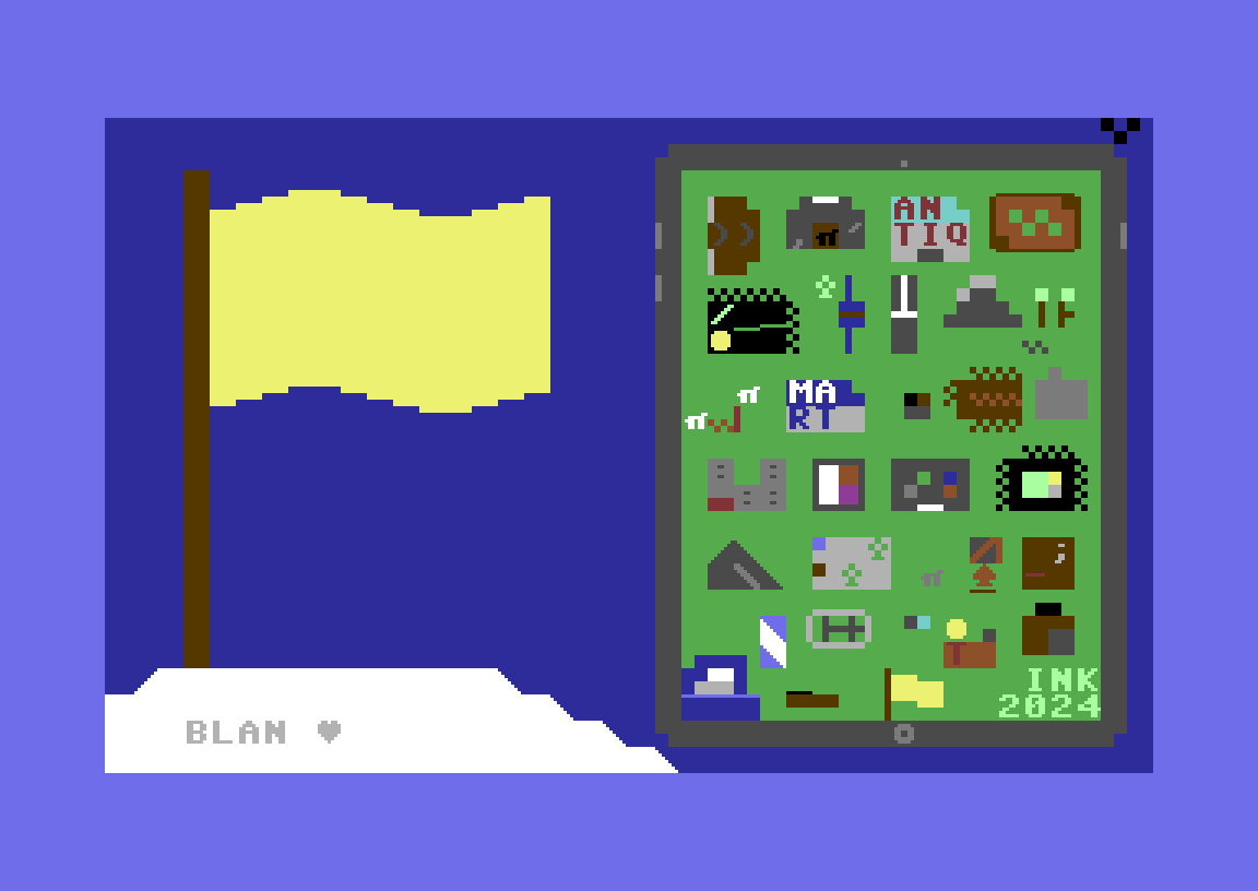
![]() |
Day 1: Backpack
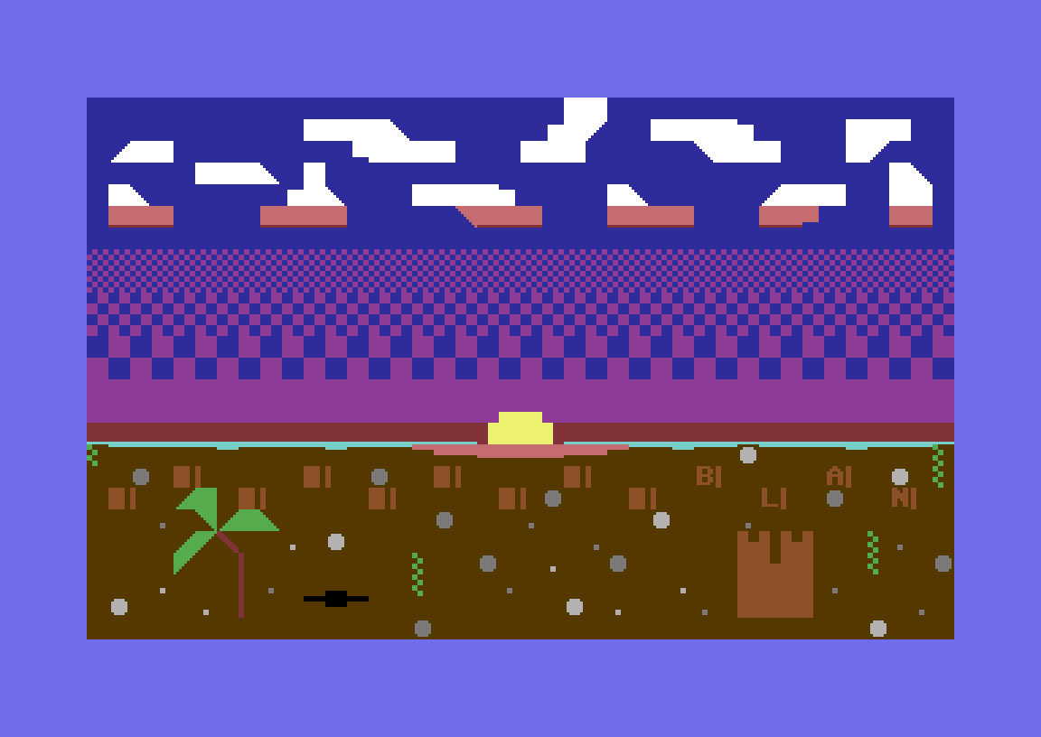
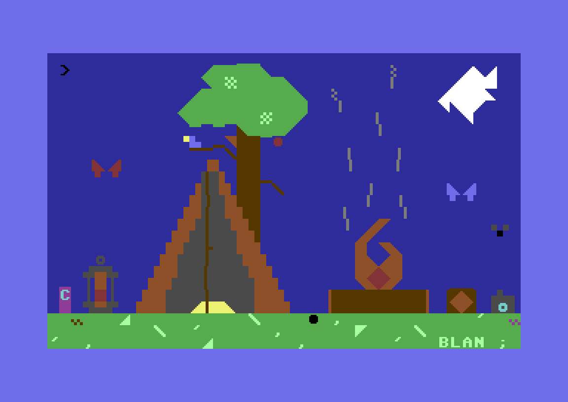
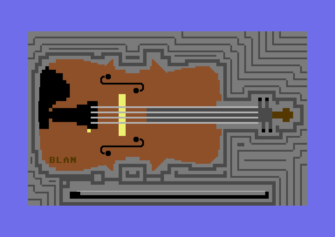
For those unaware, Inktober is an annual event where many artists make one piece per day in October with a specific theme (given as a single-word prompt). This is typically done using ink, hence the name, but for reasons that'll become clear very soon I chose not to do that here. A good friend of mine (and much better artist than I am), Mikkaya, did this in 2023 with their typical digital art style. I planned on doing something then as well, but early October came and went with a result I wasn't happy with, and I gave up before I even really got started, my idea for what I was doing was way too ambitious. This nearly happened again this time around, but I eventually settled on doing art myself in textmode style as I found it struck the right balance between being reasonable and challenging. You can think of textmode art like traditional pixel art, but each pixel has a background color and a foreground color where the foreground can be a character (though the most useful are actually just shapes!) in a pixelated font. I'm using lvllvl for this, it's a very convenient and robust browser-based tool for this kind of thing. Here I've gone with a color palette and font reminiscent of the Commodore 64. That was the default of the site. There is no other reason. I was introduced to this artform via this Brandon James Greer video I saw while back and it just seemed like a cool thing to try out. I'll note I chose to not have the option to rotate or flip the characters in each gridspace (an option recommended for beginners), as I felt that will lead to solving interesting problems. Like Mikka did last year, I've decided to hide my signature/nickname "BLAN" in all pieces (they also included the theme word in their pieces, but I only have so many gridspaces to work with). Here I've decided to go with the backpack front and center with a mountain in the distance. This is as a very obvious nod to Celeste, and I tried covering it up by using a yellow flag instead of red, but it was spotted nonetheless. For a first piece I'm pretty happy with all the little details. |
![]() |
Day 2: DiscoverThe realization of what to depict in this piece hit me like a truck, as soon as the idea came to me, it was absolutely locked in. The reason there's a kitty here is because on the morning of October, Friday the 13th, 2023, my sister found a black cat which arrived in our garage. I'm not making that up, that genuinely happened. The cat that we soon named Salem didn't stay with us for very long (he's doing just fine though at my grandmother's house, fret not), but the experience I had with him was an unforgettable week to say the least. I think I did a pretty good job drawing a kitty in this style. |
![]() |
Day 3: BootsI chose an antique store vibe for this piece, mainly because I liked the idea of drawing a bunch of little things within the same scene. In hindsight, this isn't too dissimilar in concept to this piece Mikka did the previous year, it's one of the most distinct pieces they created that month. It's at this point I should probably avoid repeatedly saying "I did well." at the end of each description. |
![]() |
Day 4: ExoticThis theme went from one of my most hated to favorite themes on the entire list. The hardest part was deciding what to draw. If you're a nerd like I am, you can easily recognize the green thing in the middle as a dragon curve, a cool looking fractal which works quite well in textmode form I'd say. I'm especially proud of everything I surrounded the fractal with, the dots, rings, and L-shaped waves make it look so...deliberate?—intentionally composed, yet abstract? Hard to explain, but cool nonetheless. |
![]() |
Day 5: BinocularsYou might have noticed by now that I'm not really interested in representing the theme itself as much, but what surrounds it. I still adhere to the theme, of course, but if I go tangentially related, I find I get interesting results. Although chaotic, I think this is a decent representation of what birdwatchers may see in a lively outdoor area. |
![]() |
Day 6: TrekThis trek up a different mountain at night I think it contrasts well with the previous piece. Going with an even more limited palette than I already had, and keeping everything very simple yet not boring. I didn't have to go with the night here, but I found the typical blue background a bit too samey. This won't be the last time I opt for a non-blue background for variety's sake. |
![]() |
Day 7: PassportCanada was the country I thought of first to see if their passport was any good, and let's just say she delivered. And of course I couldn't have a passport without a plane, was a bit tricky to get right, but I got there in the end. |
![]() |
Day 8: HikeNow, this is the start of a bit of a problem with this list, themes that are too similar to each other. That isn't super relevant to this piece specifically, but this does become relevant later so I'm bringing it up now. Here the main thought that came to mind was a tiny bridge across a tiny river. Not sure if the scale comes across on the ground, but I think I managed to pull that off with the checkerboards of the trees. |
![]() |
Day 9: SunHere, there was a bit of an issue with trying to represent what's around the theme rather than the theme itself despite that being objectively the correct choice. If I were to draw the solar system, it would result in most of the piece being either empty or just filled with stars, neither of which I particularly liked. The solution I went with is space highways. Even during my space phase as a kid, I was never this imaginative, was nice to represent that phase despite that though. |
![]() |
Day 10: NomadicOne of the first tactics I use on a theme I don't know what to do with is to just look it up on Wiktionary. Everything else kinda fell into place from there. Okay, not exactly, but the counting sheep idea came to mind after not too long, and by the time I was done with that (and other weird things I decided to hide in the grass), I thought I'd put a transcription of "Mary Had A Little Lamb" in the background. |
![]() |
Day 11: SnacksThis one isn't as cohesive as the antique shop piece, but I still think this is of acceptable quality by my standards. My somewhat strange relationship with food definitely doesn't help, though. |
![]() |
Day 12: RemoteThis piece marks the start of a trend: taking the theme and finding a silly way to interpret it. Here, you can clearly see a Wii remote going right into an old TV. I think everyone and their mother has seen or heard of elderly losing grip of a remote without the strap only for their TV to become an unfortunate victim. |
![]() |
Day 13: HorizonA sunset over a beach horizon immediately made sense to me. The palette didn't quite have sand colors, but I think I still managed to create something neat. |
![]() |
Day 14: RoamHere's another silly idea: roombas cleaning up a comically dirty floor. I feel that this piece only works because you can clearly see the paths of clean the roombas leave behind. |
![]() |
Day 15: GuidebookOkay, this one might be the weirdest in the entire set. I won't pretend I've read The Hitchhiker's Guide to the Galaxy, but I've heard great things about it. This didn't make the task easy, and in hindsight, I might've come up with something more within my comfort zone if I had more time. On the right, it depicts the distinct versions of the story: the radio version in 1978, the movie in 2005, the TV series in 1981, and the text-based adventure in 1984. This should be correct, assuming Wikipedia is accurate. |
![]() |
Day 16: GrungyIf you know me at all, you'll know I've been interested in modded content for Keep Talking and Nobody Explodes for many years. I won't go too in-depth here, I could talk about it all day if you let me. When grungy came to mind, so did "Double-Oh", a module that's as old as it looks, but remains a classic. I did have to add many other bits and bobs alongside the very clearly Double-Oh inspired buttons and display, but it made for a great starting point. |
![]() |
Day 17: JournalJournaling isn't something I really do. I imagine if it were, this page wouldn't have taken me nearly as long to finish. But anyway, I really liked the idea of having the shapes on the right-hand side with photographs each predominantly featuring said shape. The shapes I chose might be the most obscure reference in the entire set, so obscure, in fact, that I'm not going to tell you. Feel free to contact me on Discord with any guesses should you have any. |
![]() |
Day 18: DriveIn hindsight, this one might be the dullest in the whole set. The car doesn't look half bad, it's more intricate than the mountain at night near the start. However, it's not exactly something that would excite my father, a mechanic and massive car nerd. I tried to remedy this with rain effects but that's also fairly dull. |
![]() |
Day 19: RidgeAlthough this theme avoids the "too similar" issue present elsewhere on the list, this theme is by far the worst. I feel like the piece is more representative of that fact than anything I put into this piece deliberately. |
![]() |
Day 20: UnchartedI think the idea of having an X-marks-the-spot pirate map, that also leads to uncharted territory, is quite clever. I'm not sure how apparent card suits in the font have been up until this point, but I also have to highlight the clever use of clubs as stand-ins for trees. |
![]() |
Day 21: RhinocerosBy far the weirdest theme on the list—what more is there to say? |
![]() |
Day 22: CampYou might notice here I included bits of previous pieces within this one. It might be seen as lazy (and that's not entirely wrong), I like to think it makes the set feel more cohesive. It's a simple piece but not boring which is a win in my book. |
![]() |
Day 23: RustHello to all programmers and non-programmers reading this. I put code in the Rust programming language in this piece. I think it's funny, you might not, but I hope you enjoy this interpretation of the theme either way. Kudos if you've noticed any inconspicuous semicolons in other pieces, basically all of them are deliberate. |
![]() |
Day 24: ExpeditionAnd at this point you can see I've given up completely! I like the themes overall and I know why they are the way they are, but eventually, it became a chore to keep coming up with ideas. So rather than another journey-themed piece, here's what my battlestation looks like in textmode form. Is it a cop-out? Yes (though it could be argued this project is an expedition, adhering to the theme). Do I care? I refuse to answer. Oh and as a bonus fact, I was unable to connect to the lvllvl site that day, fortunately I was able to use a version of the tool available on itch.io. |
![]() |
Day 25: ScarecrowBelieve it or not, this is the only piece with Halloween theming in the whole set! Couldn't really make a unique spin on this one, but I think it still looks great. |
![]() |
Day 26: CameraThis won't be the last very literal interpretation piece, but I think I'm pretty good at getting in little details in these cases. A close up just felt right given it's, well, a camera. |
![]() |
Day 27: RoadHere's the last silly idea I had! To the two of you that live under a rock, these kids mats of roads in cities with copy-pasted buildings are a symbol of childhood. I think this is a fairly faithful adaptation of one in textmode form. |
![]() |
Day 28: JumboRelevant to this piece is the timing: I decided that while I'm allowed to come up with ideas in advance as I had the entire theme list in advance, I didn't do any art until the day of. (Mikka did a lot of their art in advance, which is definitely a good call especially at the scale and quality they were after.) I started this piece ridiculously late, I had less than two hours for sure. Likely wasn't the smartest move to include a rotationally symmetric jumbo playing card, but a piece finished at 11:56 PM is still a piece finished before midnight. |
![]() |
Day 29: NavigatorLong story short, the Wiktionary method lead me here. A ship but not necessarily a pirate ship? It sure is something. |
![]() |
Day 30: ViolinVi-o-lin. Another literal interpretation with lines radiating outward for visual interest. |
![]() |
Day 31: LandmarkHere's the finale! Remember the piece to the left of that enormous paragraph (which some might not have read)? The mountain was there so I could do this at the end! Really hammers home that all pieces are from the same universe. To add to this cohesion, the tablet has a small section reminiscent of every piece including this one (feel free to work out how they're arranged yourself). I'm very glad that I was able to pull through this year, in an art style I never touched until I started this project. I have no idea if I'll ever do this in the future, but at least I can say I've done it now, I got exactly what I wanted out of it. I can't thank Mikka and their Discord enough for giving me the push I needed; setting up a channel specifically for this was a massive motivator. Please show them some love by checking out Mikka's art at this link I have no shame in including here a second time, they're incredibly talented. And uh, thank you for reading this, it means a lot. ♥ |